It was about a year ago that Jen and I were getting ready to sit down for dinner at our good friends' Todd & Emily's home in North Carolina when I saw the initial designs for my book cover for the first time. It was a surreal moment.
I'll be honest, before seeing the first cover designs, I was afraid of how it might turn out.
What if I don't like it? I remember thinking. What if it looks nothing like what my book is actually about and I have to go back and ask them to change it? I don't want to be that guy.
Fortunately, I was thrilled with how the artwork turned out.


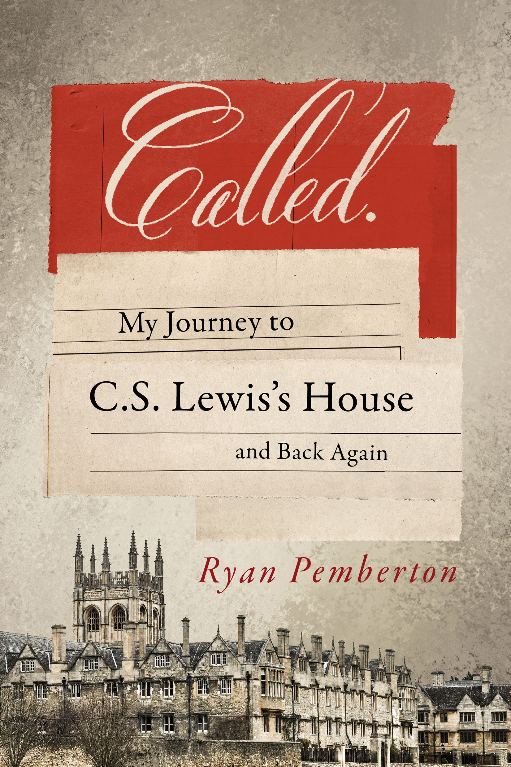
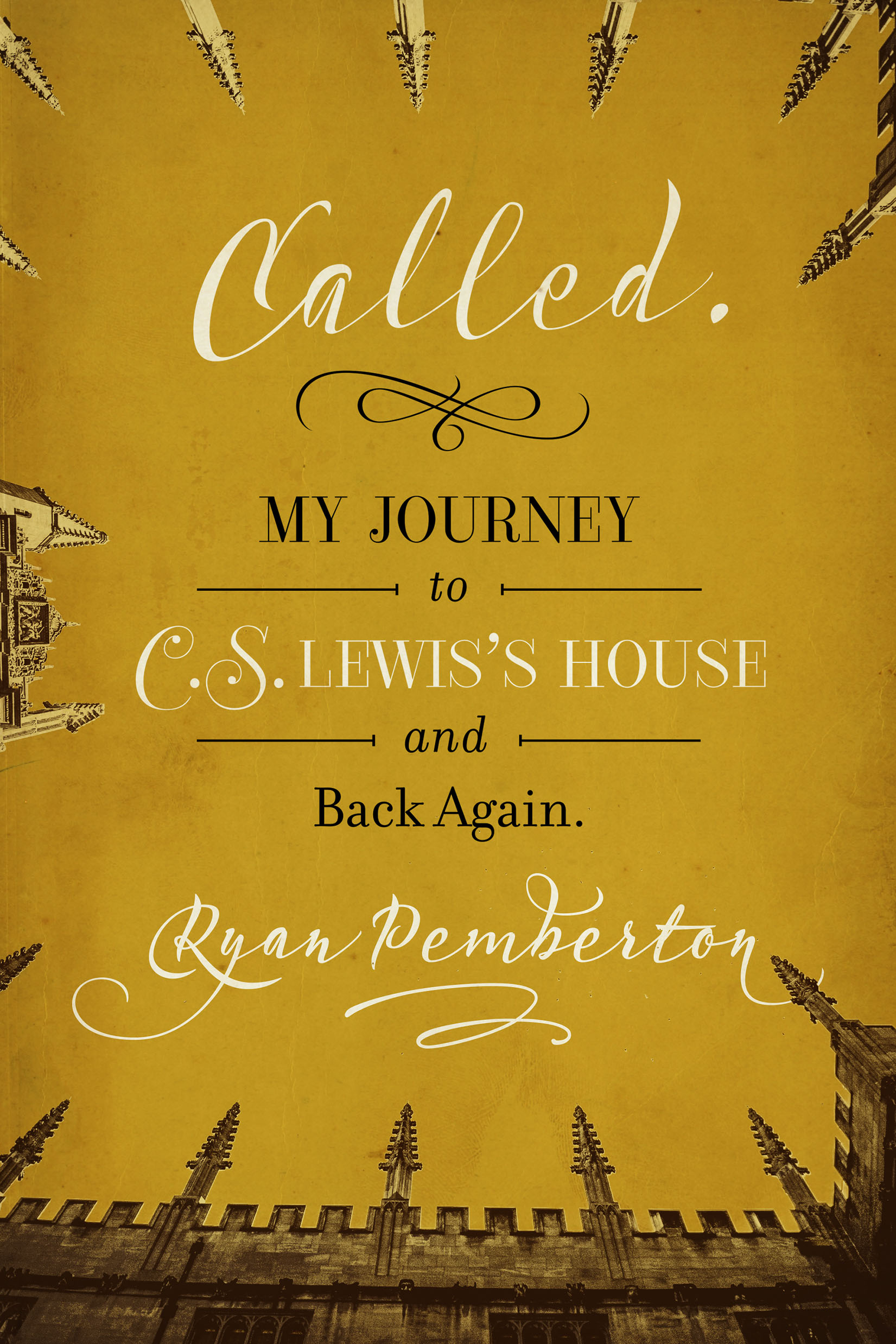
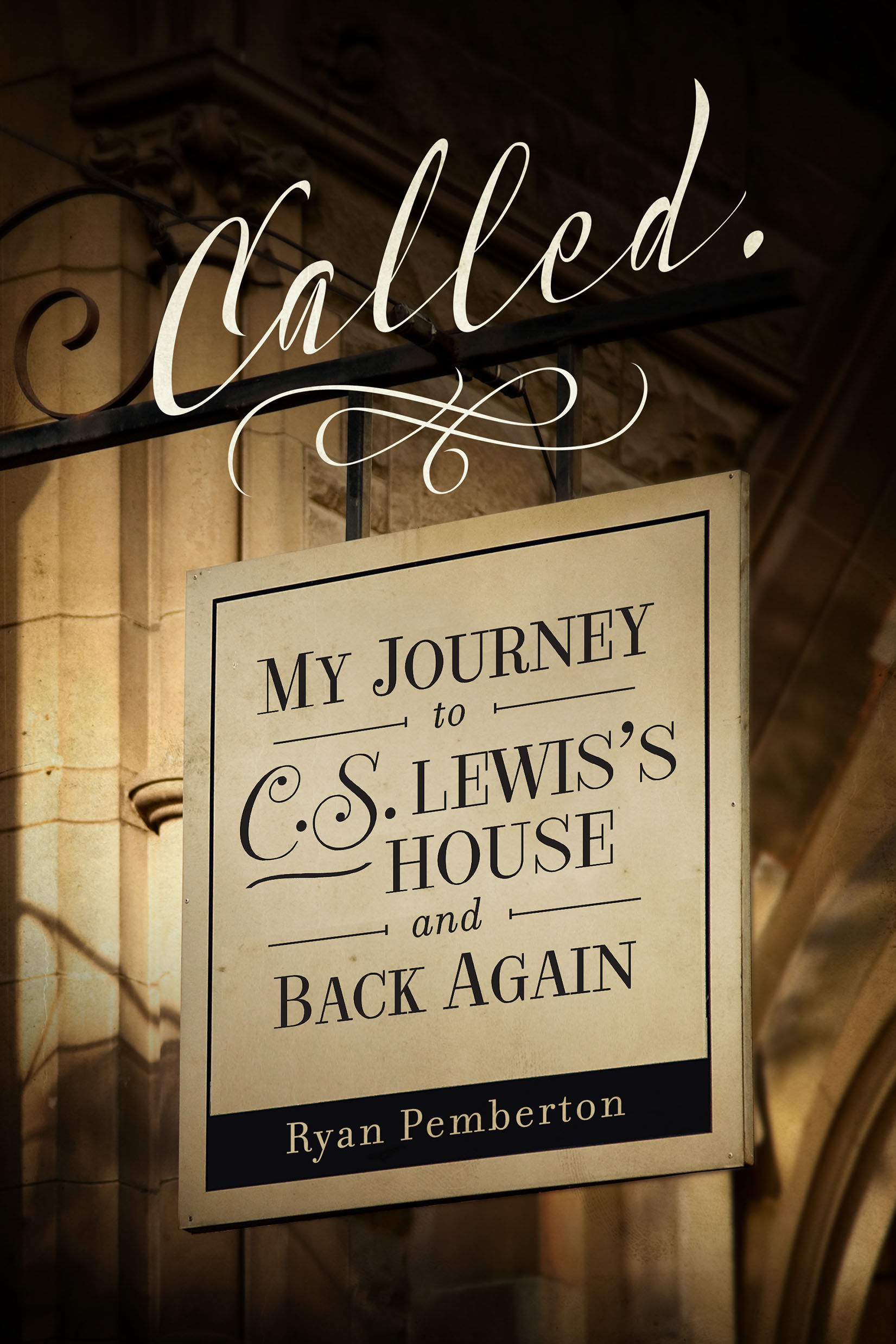
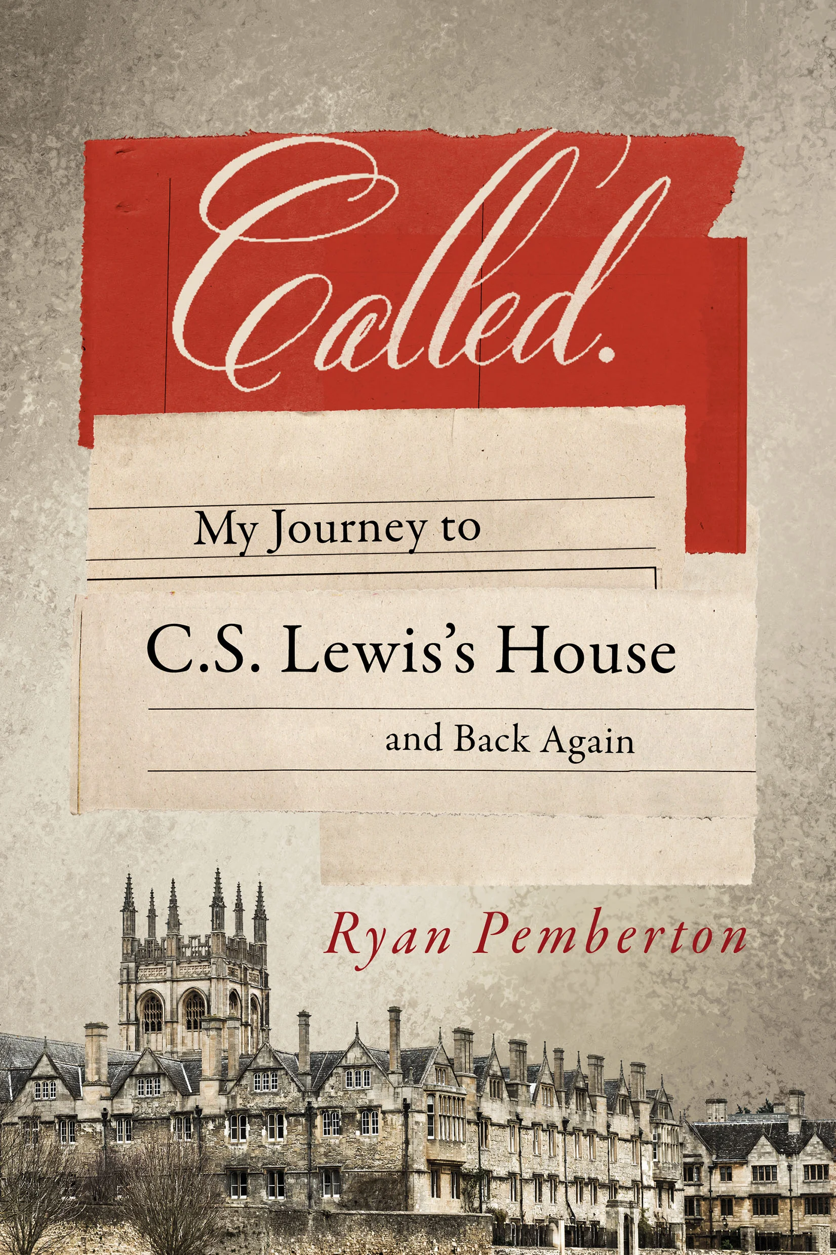
ThinkPen Design originally created three covers for Called. All of them brought something unique to the book, but ultimately it was the upward looking view of the Oxford spires that caught my attention and best captured what Called was about.
Interestingly, that wasn't the cover my publisher originally would've chosen. They had their eyes on one of the other three.
What about you? Which cover of Called do you like best? Can you imagine Called with a different cover?
#CalledTheJourney
